Technological advancements in analytic tools like Microsoft PowerBI offer the opportunity for FDs and CFOs to visually present data to their leadership teams through a finance dashboard.
With the advent of interactive financial dashboards, it can be tempting to think static management reporting packs might become a thing of the past, but is that the case?
The two terms: ‘dashboard’ and ‘report’, which are now part of the everyday lexicon for businesses, have become interchangeable. Although they perform similar functions, they are very different tools, and there is an independent role for each.
Related | The tech-enabled FD: How to become tomorrow’s FD
Finance reports: A snapshot of your finances
Reports are static documents containing data in a fixed form showing management the performance and state of the company. They are a ‘point in time’ and are generally backwards-looking. Management packs will typically contain:
- Profit and Loss statement
- Balance Sheet statement
- Cash flow statement
- Comparisons to budgets, forecasts, and prior periods
- Commentary to bring the numbers to life
- Analysis by department, segment, product line, customer, or other splits relevant to the business
- Outstanding debtor and creditor positions with an ageing analysis
The strength of management packs prepared by finance departments is the financial information they convey. Strong accurate financial reports are vital for a business and are often required by lenders, investors, and other interested parties.
In general, if they have weaknesses, it’s that they can be too number heavy, lacking charts, graphs and other visuals, and that they don’t contain other non-financial information that can be more forward-looking. Being static they also lack interactivity and drill down to the underlying data.
Finance dashboards: Real-time representation of KPIs, anytime, anyplace, anywhere
The purpose of a dashboard is different from a monthly management pack. Just like a dashboard in a car a quick glance should show a few key indicators and in particular highlight any areas where urgent action is required.
In contrast to many financial management packs, good dashboards will use data from multiple sources, including the operational systems of a business, to provide a visual, real-time, at-a-glance view of what’s going on in a company with the aim of providing management with information needed to take immediate action.
Where once dashboards were the preserve of the senior leadership team, with the development of analytics tools, every department across a business can now securely access relevant data in real-time, anytime, anyplace, anywhere.
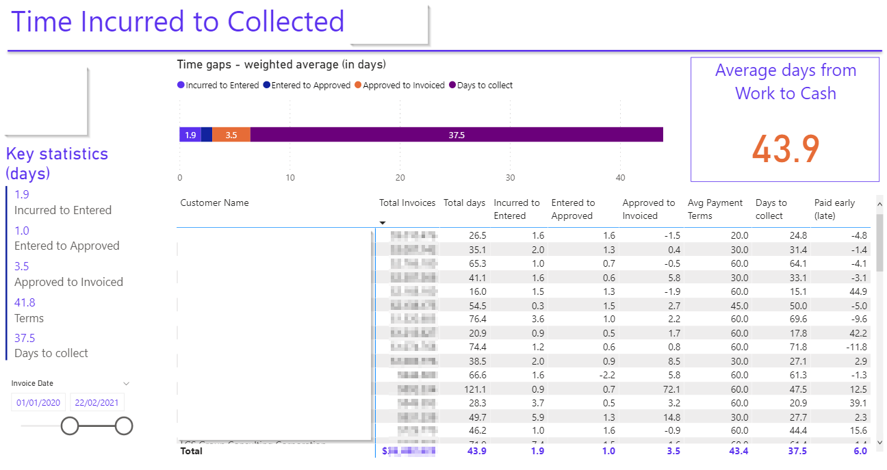
Modern business intelligence tools generally allow end-users to interact with dashboards, drilling down into the detail behind the top-level numbers and getting their own insights by answering their own questions.
Related | How ireport helps management teams visualise information
Drilling down: dashboards vs reports
- At a glance information: dashboards are the tool of choice here; it’s normal to have a single pane of glass with all the key indicators on and to use colour and other visual indicators to immediately draw the eye to an area of concern and while the same can be employed in management reports, in general, these are multi-page reports.
- Alerts: modern business intelligence systems can be set with thresholds and alert triggers to send emails or post messages in tools such as Teams or Slack when conditions are met. Static reporting packs generated in Excel can’t do this.
- Point in time position: since dashboards tend to be real-time it’s often hard to wind back the clock to see what the position was at a point in the past. For financial results, management packs produced as PDFs give a permanent record of the position of a company at the reporting date, usually at a month, quarter, or year-end.
- Drilldown: dashboards in modern business intelligence systems will nearly always allow users to drill down to the underlying data enabling further analysis. Management reporting packs almost never allow for this.
- Commentary: in theory, both dashboards and reporting packs allow for the addition of commentary. A good management reporting pack will be prepared together by an experienced finance team who understand the business and can take some time and thought to analyse the numbers and provide management with useful commentary (although there are sadly many examples of management packs that consist of nothing but tables of numbers with no explanation). It’s much more difficult to do this with real-time dashboards, although artificial intelligence is being employed to generate insights written in natural language. But of course, AI can’t know what conversations are currently going on around the business or what’s preoccupying management and so can’t focus its generated commentary on topics that are particularly current.
- Multiple data sources: there’s no reason why both management reporting packs and dashboards can’t contain data from any number of data sources. In practice, monthly management packs tend to concern themselves with financial information whereas business intelligence system-produced dashboards blend data from multiple sources.
A common reaction to seeing reports and dashboards created in a modern business intelligence system with eye-catching visuals and interactive features is to think that the traditional monthly reporting pack produced by the finance department could be rendered obsolete.
Related | Case study: Visual analytics for global data transformation consultancy
However, both have their place. The strength of a monthly reporting pack with its full suite of financial statements is the detailed and comprehensive view they give of a company at a point in time. This level of reporting will often be demanded by lenders and investors and their static nature serves as a record that can always be referred to at a future date. In a good reporting pack, an insightful commentary will also tell the story of the numbers and visuals will be employed to complement the numbers.
In contrast, the strength of dashboards in business intelligence systems is their interactivity, their ability to show real-time data and to enable users to drill down to underlying data.
Both have their place and should be in the toolkit of a modern tech-enabled finance department.
Related | Why choose Power BI as your business intelligence platform